Apple Watch: The major changes coming to your wrist this year – and why some of them might surprise you
Views: 2089
2023-06-22 03:55
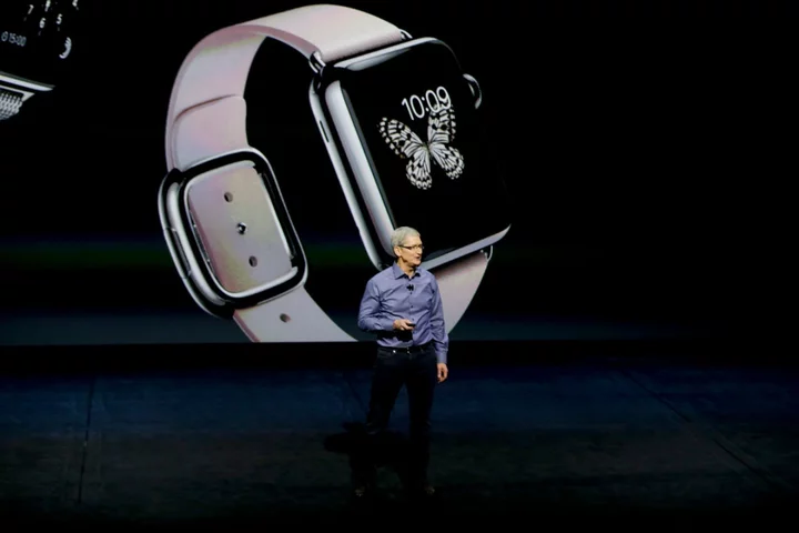
This autumn, Apple releases watchOS 10, the tenth-generation software for the Apple Watch, which went on sale in Spring 2015. In that time, there have been big developments in hardware, including the addition of an always-on display, Watches that connect direct to the mobile phone network, health advances like ECG, blood oxygen measurements, fall detection and more. And the software has been upgraded hugely, too, including new ways to interact with the Watch. Kevin Lynch, Apple’s Vice President of Technology, and Deidre Caldbeck, Director of Apple Watch Product Marketing, sat down exclusively with The Independent to talk about how things have changed. What’s been consistent over the years is that unlike many other devices, the all-day proximity means the Watch offers benefits without you interacting with it at all. Simply wearing it allows the Watch to monitor your heart rate and let you know if something’s amiss. In fact, the heart rate monitor was built into the first Apple Watch – at a time when few other wearables had such a sensor – for a more mundane task. Lynch explains, “We decided to focus on the heart in the early days, to get accurate calorimetry.” In other words, while most smart watches counted the calories you were burning through knowing your height and likely stride length, the Apple Watch was more precise because it took your exertions into account. “We built the sensor and showed you a way to view your heart rate. We didn’t really think that in itself was going to be compelling because you can measure your heart rate yourself just by putting your finger on your wrist and counting. But we found some people were looking at the heart rate and, when it looked weird, they talked to their doctor and found they discovered something about their health that they weren’t aware of. They started writing us letters about this – and we are still getting them today.” This led to Apple searching for ways to make the heart rate measurements more powerful. The Watch can now let you know if it spots your heart rate unexpected high or low, and led to sleep tracking and more recently monitoring overnight respiratory rate. This autumn will also see a focus on mental health as well as physical. The Watch already has meditation capabilities in the Mindfulness app but this will expand with a place to log emotions and daily moods. The Medications app will be able to send reminders if taking your medication hasn’t been logged on schedule. But Apple Watch has always reached beyond its health capabilities, major though those are. Lynch goes on, “Our question was also, how do we enable your Watch to be a key to the world?” This led to Apple Pay, so a double-tap on the side button lets you pay at a card reader, show a boarding pass, unlock a car or a hotel room and so on. Beyond that, Lynch says, “We look at how do we continue improving the experience, having the willingness to rethink and re-imagine, based on what our users are telling us.” That’s timely because this autumn there will be big changes in how the Watch will be used, even down to what individual buttons do. The new software sees the arrival of widgets on the Watch. Widgets are those highly useful items on a computer desktop or phone home screen that show updateable information. So, where the Fitness app on the iPhone shows a generic image, the Fitness widget tells you exactly how active you’ve been today, for instance. Or the widget for an app like the flight tracking app, Flighty, reminds you how many days until your next flight, or if it’s behind schedule. This is highly useful as previously most extra information on the Watch has been shown through complications, those little areas of some Watch faces that can show the date, today’s temperature, battery charge and so on. Those remain, but with watchOS 10, by turning the Digital Crown, a new stack of widgets scroll up on to the display. This means you can have a spare, simple Watch face but easy access to lots of stuff. Lynch explains, “We can show information with the Smart Stack. You can have a beautiful face like the Palette or Snoopy or whichever graphical face you’d like and have that extra information easily. Internally we called that ‘cake’, as in ‘have your cake and eat it too’.” The Snoopy and Woodstock Watch face, looks like it will be another highlight of watchOS 10, by the way. But this change means that the functions of the buttons have changed. Control Centre is the place where you turn your Watch to silent when you go to the theatre (you do remember to do this, don’t you?) or ping your iPhone when you can’t find it, for instance. It’s very useful and right now you invoke it by swiping up on the display, though this only works from the Watch’s home screen. With watchOS 10, you can’t do this any more, instead pressing the side button. The big benefit is it now works from any screen on the Watch, not just the home screen. But it’s a big change, which could be confusing for users. How carefully does Apple think about making these modifications? Caldbeck says, “It’s a big change but it’s worthwhile making and that is what comes into play when we make a decision like that. We think, how can we continue to evolve and improve the experience? And how can we take the things that you love about Apple Watch and make them better? “And sometimes it does mean we have to change something about the way you interact with the Watch to make it better. The side button is a really good example. We have tried different things with the side button, over the years. We originally had the friends circle so you could contact people close to you. And we know that Apple Pay is really compelling. But when you ask what are some of the other things that users need access to anytime, anywhere, that really that ends up being Control Centre.” Before you panic, this doesn’t mean that Apple Pay is about to change. As Lynch explains, “That is hardware-instrumented so it’s not only down to software. The double-press is wired at a low level physically and electronically so that you can’t fake it out. It means that no software can pretend that you’re trying to buy something, you have to have the double press to activate it at a low level. So, if we did want to change that, it would be quite extensive.” Apple is clearly careful when it comes to these changes. So, how do they come about? Lynch’s reply confirms the thoughtfulness. “Part of how we do this is we start with storytelling, until we get to a place where we think, wow, that would be really cool if the future was like that. Then we try it out. So, we’ll build prototypes, and carry them around ourselves. And it’s this stage, which we call ‘the carry’, where we live with the changes ourselves over time. Some of these things might initially feel strange but after a day or two you start feeling like, oh well, this is obvious now, it’s totally natural, and then people don’t want to go back. That’s when we know that we’ve got a good thing here.” Hardware and software are so thoroughly integrated, so I finally ask how many decisions come back to the battery. Lynch explains, “The way we look at power management comes at the beginning of each release and it’s a multi-year road map. We use the battery model as a fundamental element in talking about the features, we’re going to do. Everything we do has a power budget and we look to save power with other ideas to optimise power, so, we have some focused work each year to improve battery life from a software perspective, And then we invest some of those savings into new features that we are now able to do. “That’s combined with the hardware team working on battery, packaging, chemistry and all the electronics. The system on a chip from the silicon team continues to have improvements on power requirements. Part of how we did the always-on display was through the hardware, silicon and display teams working together and really was key to enabling it. “We have battery models that model average user activities. We call it ‘a day in the life’ and it represents the way many users use Apple Watch. We model the battery consumption we have quite ambitious targets each year. The battery life work is super obsessive.” The Apple Watch routinely lasts longer than a full day, of course. But battery anxiety is the malady of the twenty-first century, so it’s good to know Apple is serious about this. There’s plenty more to the new Watch software, from more advanced cycling workouts to automatically generated waypoints for hikers to NameDrop, where you tap your Watch on someone’s iPhone or Watch to transfer your contact details. The software will go on general release in the autumn, with a public beta version available next month. Read More Apple Watch 7 pre-order: How to buy the new smartwatch in the UK Apple introduces new version of Watch with complete redesign iPhone 13 - live: UK contract deals and prices for Apple, EE and O2 Apple seeks trademark of ‘actual apple’, Swiss fruit association says The new iPhone could have a major clue about Apple’s headset Man locked out of smart home for a week after he was accused of being racist

This autumn, Apple releases watchOS 10, the tenth-generation software for the Apple Watch, which went on sale in Spring 2015. In that time, there have been big developments in hardware, including the addition of an always-on display, Watches that connect direct to the mobile phone network, health advances like ECG, blood oxygen measurements, fall detection and more. And the software has been upgraded hugely, too, including new ways to interact with the Watch.
Kevin Lynch, Apple’s Vice President of Technology, and Deidre Caldbeck, Director of Apple Watch Product Marketing, sat down exclusively with The Independent to talk about how things have changed.
What’s been consistent over the years is that unlike many other devices, the all-day proximity means the Watch offers benefits without you interacting with it at all. Simply wearing it allows the Watch to monitor your heart rate and let you know if something’s amiss. In fact, the heart rate monitor was built into the first Apple Watch – at a time when few other wearables had such a sensor – for a more mundane task. Lynch explains, “We decided to focus on the heart in the early days, to get accurate calorimetry.”
In other words, while most smart watches counted the calories you were burning through knowing your height and likely stride length, the Apple Watch was more precise because it took your exertions into account. “We built the sensor and showed you a way to view your heart rate. We didn’t really think that in itself was going to be compelling because you can measure your heart rate yourself just by putting your finger on your wrist and counting. But we found some people were looking at the heart rate and, when it looked weird, they talked to their doctor and found they discovered something about their health that they weren’t aware of. They started writing us letters about this – and we are still getting them today.”
This led to Apple searching for ways to make the heart rate measurements more powerful. The Watch can now let you know if it spots your heart rate unexpected high or low, and led to sleep tracking and more recently monitoring overnight respiratory rate. This autumn will also see a focus on mental health as well as physical. The Watch already has meditation capabilities in the Mindfulness app but this will expand with a place to log emotions and daily moods. The Medications app will be able to send reminders if taking your medication hasn’t been logged on schedule. But Apple Watch has always reached beyond its health capabilities, major though those are.
Lynch goes on, “Our question was also, how do we enable your Watch to be a key to the world?” This led to Apple Pay, so a double-tap on the side button lets you pay at a card reader, show a boarding pass, unlock a car or a hotel room and so on. Beyond that, Lynch says, “We look at how do we continue improving the experience, having the willingness to rethink and re-imagine, based on what our users are telling us.”
That’s timely because this autumn there will be big changes in how the Watch will be used, even down to what individual buttons do. The new software sees the arrival of widgets on the Watch.
Widgets are those highly useful items on a computer desktop or phone home screen that show updateable information. So, where the Fitness app on the iPhone shows a generic image, the Fitness widget tells you exactly how active you’ve been today, for instance. Or the widget for an app like the flight tracking app, Flighty, reminds you how many days until your next flight, or if it’s behind schedule.
This is highly useful as previously most extra information on the Watch has been shown through complications, those little areas of some Watch faces that can show the date, today’s temperature, battery charge and so on. Those remain, but with watchOS 10, by turning the Digital Crown, a new stack of widgets scroll up on to the display. This means you can have a spare, simple Watch face but easy access to lots of stuff.
Lynch explains, “We can show information with the Smart Stack. You can have a beautiful face like the Palette or Snoopy or whichever graphical face you’d like and have that extra information easily. Internally we called that ‘cake’, as in ‘have your cake and eat it too’.” The Snoopy and Woodstock Watch face, looks like it will be another highlight of watchOS 10, by the way.
But this change means that the functions of the buttons have changed. Control Centre is the place where you turn your Watch to silent when you go to the theatre (you do remember to do this, don’t you?) or ping your iPhone when you can’t find it, for instance. It’s very useful and right now you invoke it by swiping up on the display, though this only works from the Watch’s home screen. With watchOS 10, you can’t do this any more, instead pressing the side button. The big benefit is it now works from any screen on the Watch, not just the home screen.
But it’s a big change, which could be confusing for users. How carefully does Apple think about making these modifications? Caldbeck says, “It’s a big change but it’s worthwhile making and that is what comes into play when we make a decision like that. We think, how can we continue to evolve and improve the experience? And how can we take the things that you love about Apple Watch and make them better?
“And sometimes it does mean we have to change something about the way you interact with the Watch to make it better. The side button is a really good example. We have tried different things with the side button, over the years. We originally had the friends circle so you could contact people close to you. And we know that Apple Pay is really compelling. But when you ask what are some of the other things that users need access to anytime, anywhere, that really that ends up being Control Centre.”
Before you panic, this doesn’t mean that Apple Pay is about to change. As Lynch explains, “That is hardware-instrumented so it’s not only down to software. The double-press is wired at a low level physically and electronically so that you can’t fake it out. It means that no software can pretend that you’re trying to buy something, you have to have the double press to activate it at a low level. So, if we did want to change that, it would be quite extensive.”
Apple is clearly careful when it comes to these changes. So, how do they come about? Lynch’s reply confirms the thoughtfulness. “Part of how we do this is we start with storytelling, until we get to a place where we think, wow, that would be really cool if the future was like that. Then we try it out. So, we’ll build prototypes, and carry them around ourselves. And it’s this stage, which we call ‘the carry’, where we live with the changes ourselves over time. Some of these things might initially feel strange but after a day or two you start feeling like, oh well, this is obvious now, it’s totally natural, and then people don’t want to go back. That’s when we know that we’ve got a good thing here.”
Hardware and software are so thoroughly integrated, so I finally ask how many decisions come back to the battery.
Lynch explains, “The way we look at power management comes at the beginning of each release and it’s a multi-year road map. We use the battery model as a fundamental element in talking about the features, we’re going to do. Everything we do has a power budget and we look to save power with other ideas to optimise power, so, we have some focused work each year to improve battery life from a software perspective, And then we invest some of those savings into new features that we are now able to do.
“That’s combined with the hardware team working on battery, packaging, chemistry and all the electronics. The system on a chip from the silicon team continues to have improvements on power requirements. Part of how we did the always-on display was through the hardware, silicon and display teams working together and really was key to enabling it.
“We have battery models that model average user activities. We call it ‘a day in the life’ and it represents the way many users use Apple Watch. We model the battery consumption we have quite ambitious targets each year. The battery life work is super obsessive.”
The Apple Watch routinely lasts longer than a full day, of course. But battery anxiety is the malady of the twenty-first century, so it’s good to know Apple is serious about this.
There’s plenty more to the new Watch software, from more advanced cycling workouts to automatically generated waypoints for hikers to NameDrop, where you tap your Watch on someone’s iPhone or Watch to transfer your contact details. The software will go on general release in the autumn, with a public beta version available next month.
Read More
Apple Watch 7 pre-order: How to buy the new smartwatch in the UK
Apple introduces new version of Watch with complete redesign
iPhone 13 - live: UK contract deals and prices for Apple, EE and O2
Apple seeks trademark of ‘actual apple’, Swiss fruit association says
The new iPhone could have a major clue about Apple’s headset
Man locked out of smart home for a week after he was accused of being racist


