Apple's watchOS 10, which is currently available as developer beta, is a big change from the previous version.
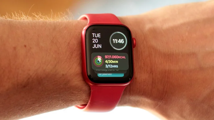
In watchOS 10, Apple decided to bring back widgets in a big way, making them a crucial part of the Watch experience with a new feature called the Smart Stack. It's a stack (duh) of widgets that let you launch apps but also give you way more data at a glance than a simple icon can.
To do this, Apple moved around certain features and changed the behavior of the Watch's buttons, which can be a bit confusing at first. We've tried out the watchOS 10 developer beta and are happy to report that the changes are fairly easy to get used to, and the widgets are quite useful.
What does this button do?
Yes, the buttons, gestures, and the crown on your Watch will behave differently in watchOS 10. Here's a quick rundown:
Press the side button once for the Control Center
Press the side button twice for Apple Pay
Press the crown once for apps list
Press the crown twice for open apps.
Slide from the top down to see notifications
Slide from the bottom up to see your widgets
Start rotating the crown to see your widgets
Yes, nearly everything has been changed. Again, you'll get used to it. The biggest change, however, is the Smart Stack, which holds your widgets, which can be nearly anything: from Weather, to Apple Music, to Activity. At the end of your widgets list in the Smart Stack, you'll once again get the option to see all of your apps.
SEE ALSO: Apple Watch0S 10 brings a widget-focused rebrand to your smart watchOrganizing the Smart Stack
To add or remove a widget, open your Smart Stack either by rotating the crown or sliding from the bottom up, then tap and hold a widget. You'll get the option to remove individual widgets, and add new ones by tapping on the empty widget with the "+" sign. Note that you can only have 7 widgets in the Smart Stack at once; if you want to add another after you've reached that limit, you'll have to removed one of the old ones.
Customizing your widgets in the Smart Stack is key to making it useful. Credit: Stan Schroeder/MashableYou can also pin one or more of your widgets to the top of your Smart Stack by tapping the yellow pin button in the upper right corner of your widgets.
Finally, you can rearrange your pinned widgets by holding and dragging them up or down.
As far as individual widgets go, half the fun is in discovering which are best suited for you. Some are more interactive than others, though; for example, the Activity widget will immediately give you an overview of your activity for the day, whereas the Mindfulness widget is merely a shortcut to launch the Mindfulness app.
On top of your Smart Stack there's a special widget that shows you the date and time; you cannot remove or change that one. Similarly, on the bottom of the Smart Stack there's another special widget that you cannot remove; it holds three shortcuts for your favorite apps, which you can customize as you wish.
How do we like it?
The Watch has changed, but even if you don't like the Smart Stack, it won't be a dealbreaker. Credit: Stan Schroeder/MashableOverall, the Smart Stack is not a complete overhaul of how your Watch works. You can ignore it and just launch apps the old-fashioned way, from the app list or grid, which is as easy to access as before. The widgets are just a more glanceable way to get more info out of your apps, and it works, though it does require some customization to really get the most out of it. Some users will certainly appreciate the added convenience, but it's not a game changer for the Watch, for better or for worse.
It's worth noting that this is only the developer beta of watchOS 10, with final, widely available version coming this fall. Apple might change some of the features and the options in watchOS 10 before it launches.


