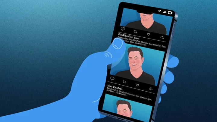
Once again, Elon Musk's design decisions for the rebranded X (formerly Twitter) are isolating users with disabilities — this time in the name of "esthetics."
On Wednesday evening, the site began rolling out a new preview format for posted links, which removes all headlines and subheader text from the post in favor of displaying only the article's header image overlaid with a publication's watermark. While Musk and his team might view the minimalist change as a step towards a sleeker version of the site, it also removes essential information for users considering clicking on third-party links.
It also implies a continued disregard for X users with disabilities, limiting accessibility to linked posts for those who use assistive technologies like screen readers and VoiceOver.
SEE ALSO: The return of political campaign ads to X/Twitter raises important questions for usersMusk has previously stated his intent to devalue third-party links on X. On Oct. 3, in response to a chart reportedly displaying declining numbers of traffic to major media sites, the CEO wrote: "Our algorithm tries to optimize time spent on X, so links don't get as much attention, because there is less time spent if people click away. Best thing is to post content in long form on this platform."
He's also demolished other longtime commitments to accessibility on the site, including the removal of Twitter's accessibility team (@TwitterA11y) and the move towards paid models that limit access to former Twitter APIs that help accessibility advocates build a more inclusive site.
By Thursday, users were expressing widespread disdain for the site change, even capitalizing on the context-less format to circulate memes and misinformation.
Other users were quick to point out how the decision was effectively killing the functionality of assistive technology to help them navigate the social platform.
"The X/Twitter update to remove headlines from link previews has also completely broken their accessibility. The link/image can't be tabbed to with the keyboard, and it's been totally hidden from screen readers," wrote developer and X user @MattEason.
Some noted that link functionality is no longer consistent across mobile and desktop versions of the site, with some users who are blind and rely on Apple's in-house screen reading technology, VoiceOver, struggling to interact with links at all. Mobile users reported screen readers displayed the new link format as simply, "link, image" without additional information on where the link directs.
Additionally, these header images no longer sport X's "ALT" badge that denotes when an image has had custom alt text added for users who are blind. Many pointed out that X's design choice may incentivize publications to add headlines or other text into header images themselves, in order to get around the preview limits. However, since interacting with the new images immediately takes users to the third-party site, those using assistive technology will not be able to hover or click on these images to read custom alternative text, if it could be added at all.
"The latest Twitter update to remove headlines from link previews is a telling example of aesthetics over accessibility. That’s what happens when you no longer have a dedicated accessibility team," wrote disability blogger Holly Tuke (@lifeofablindgrl).
Creator of resource and education hub Accessible Social Alexa Heinrich told Mother Jones that the decision is "horrible for accessibility and user experience in general."
Heinrich, Easton, and others have already shared their advice for getting around these new limitations, including:
Adding context to the written part of posts, so it's clear where links will take users
Pasting links at the top of posts, before the written block of text
Pasting links twice, if it appears at the end of a written block of text
Easton reports that, for publishers, posting articles using a "Summary Card format" rather than "Summary Card with Large Image" format can shrink the size of the image and allow X to pull summarized article information into the link card itself.
Easton also designed a tool that will format links in a more accessible manner until X fixes the inaccessibility of large image links.
In addition to growing inaccessibility, Musk's decision is a worrisome move amid his cries for increased "citizen journalism" and his own dislike of "legacy news" sites, all while the site makes a bid for increased involvement in the upcoming election season.
"Citizen journalism is the path to better future!" Musk posted on Oct. 4. "I strongly encourage people around the world to post news about events as they're happening, in both text & video."
With design decisions like these stripping users of basic site functionality, it's unclear which citizens get to participate in Musk's new X-based journalism.


